Client: Monster Brewing Co. | Agency: Monster Brewing Co. | Market: North America
Credits: Photography Joe Mellentine, Selected Illustrations: Shawn McGowan
NEW PRODUCT DEVELOPMENT | BRAND IDENTITY DESIGN | PACKAGING DESIGN
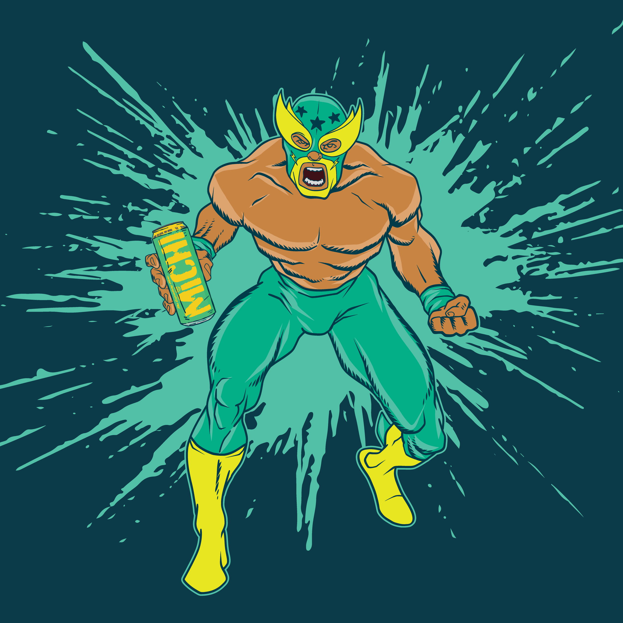

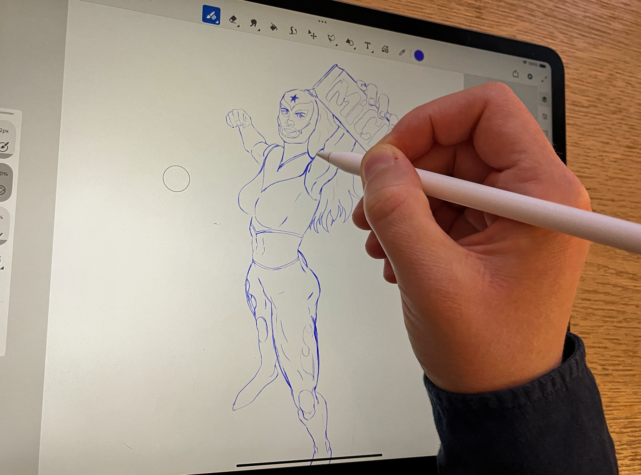
Bringing together the bold spirit of lucha libre and the refreshment of classic micheladas, Michi is a beverage brand I developed from the ground up - from brand world-building to illustration, packaging, and rollout. Each flavor stars its own masked character, inspired by the color and mythology of Mexican wrestling posters, creating a flexible system for future line extensions. Michi launched nationally with a suite of playful, collectible designs - inviting drinkers to choose their fighter and discover something new with every can.


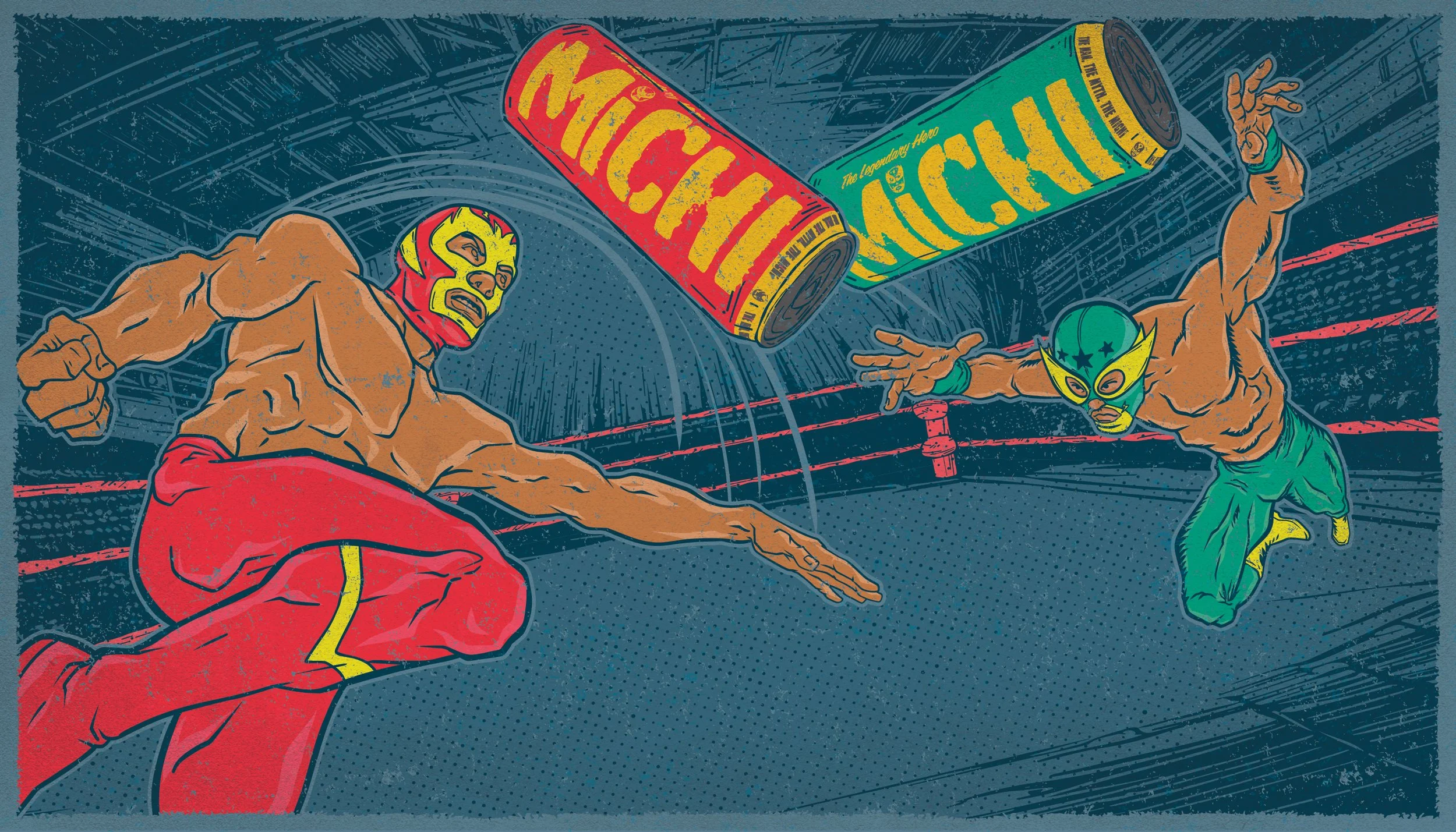
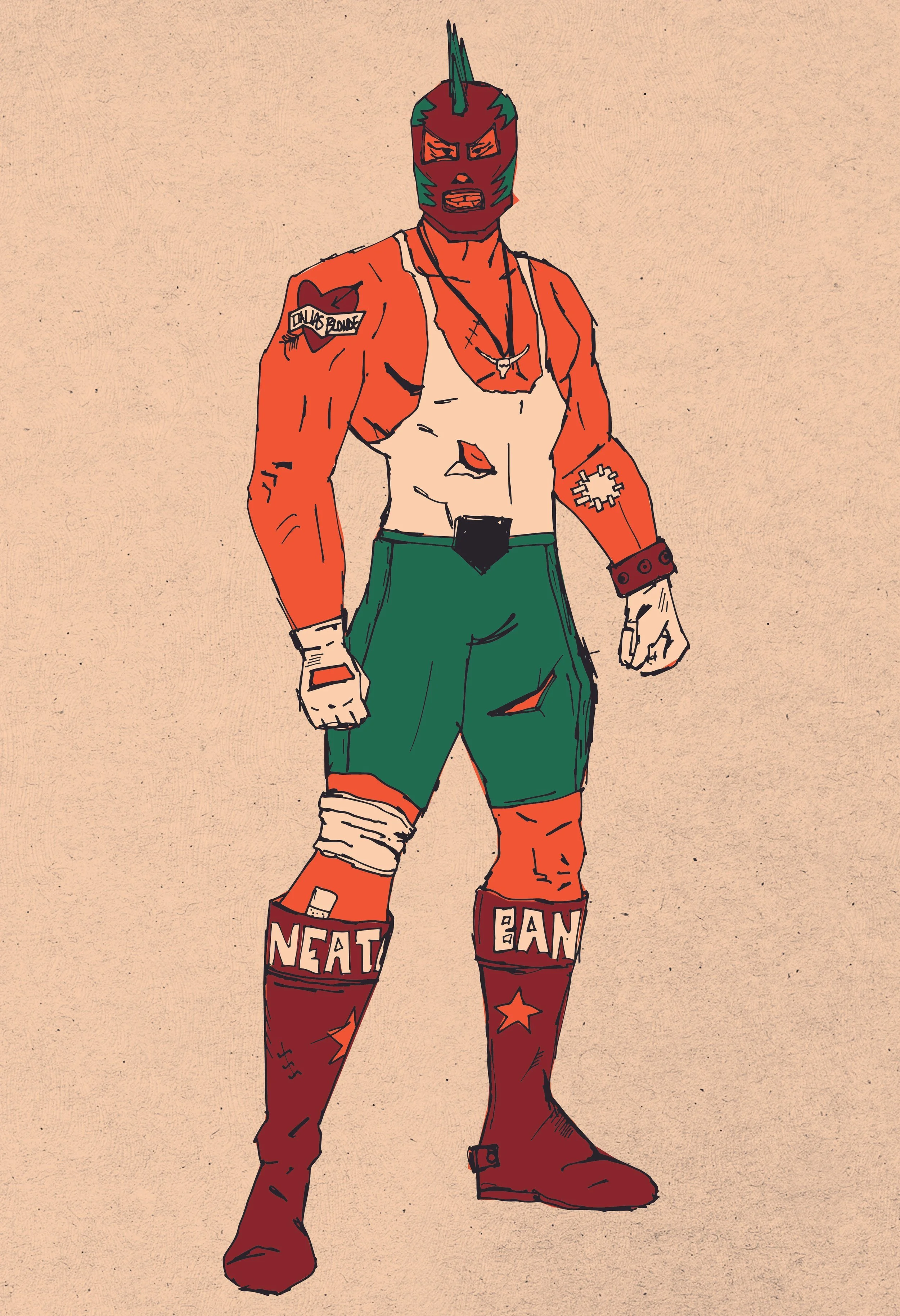
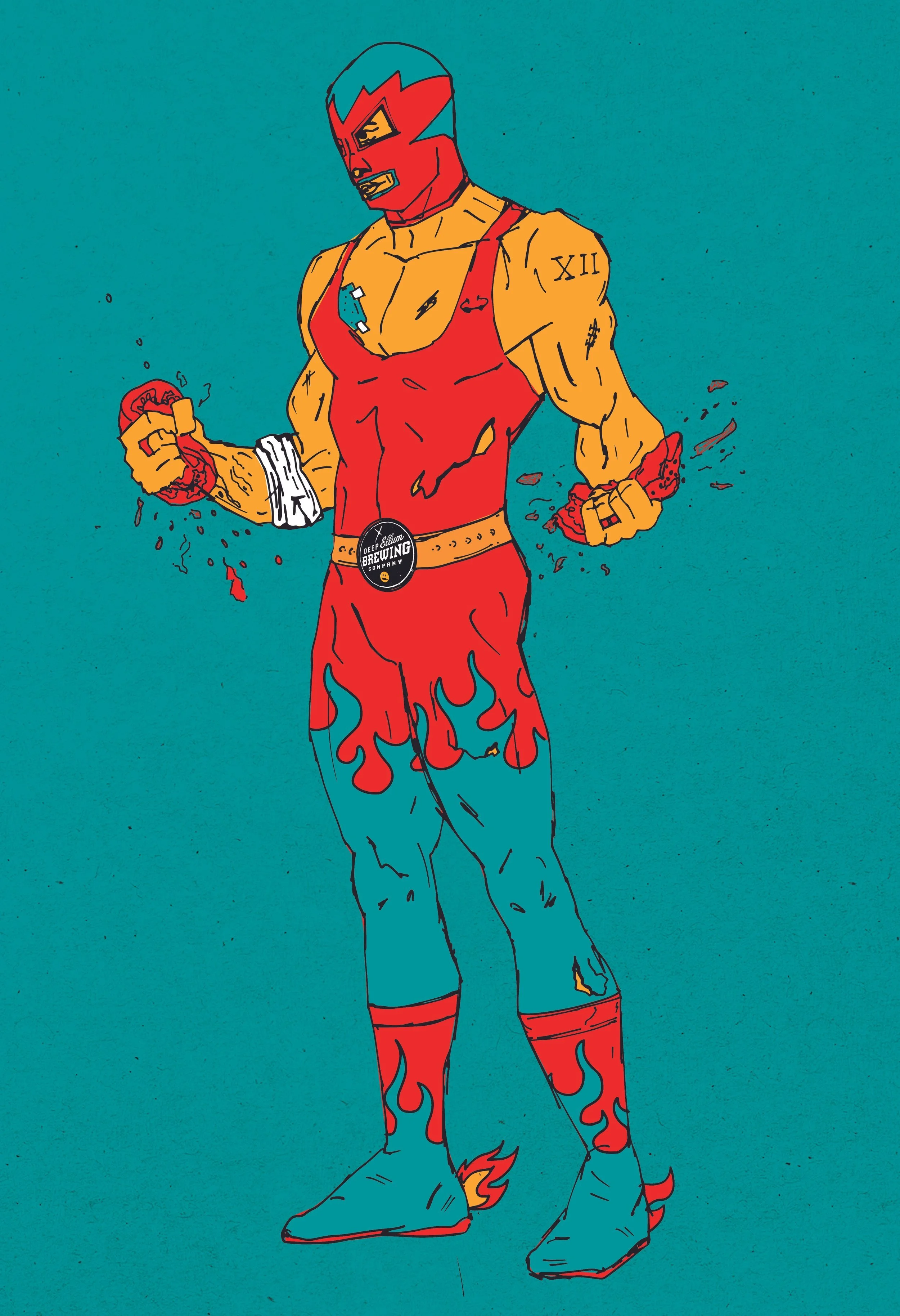
The Luchadors went through various stages of style during development. Eventually we settled on a traditional comic book design, but early on they were a gritty almost post-apocalyptic indie style. Though the line is currently two flavours, characters with costume and backstory have been developed for 9 potential flavours.